【UI UX Web Design】Dark Mode
Home › App Design › 【UI UX Web Design】Dark Mode
Dark mode is becoming increasingly popular in web design due to its modern aesthetic and practical benefits. This blog explores what dark mode is, its advantages, best practices for implementation, and examples of successful dark mode designs.
What is Dark Mode?
Common Use Cases and Platforms
Benefits of Dark Mode in Web Design
Enhanced Visual Appeal
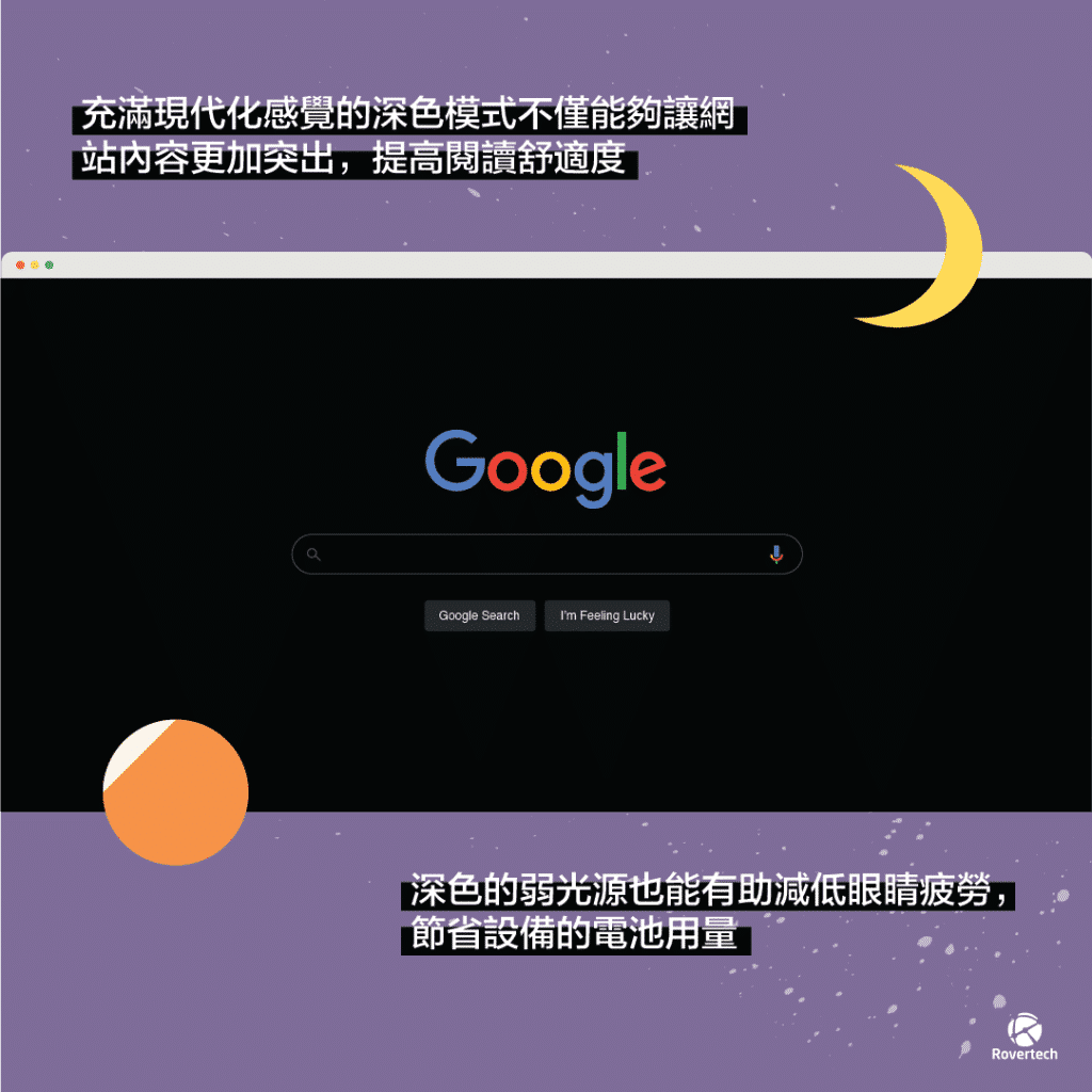
Dark mode gives websites a sleek and modern look. It helps make content stand out, providing a visually striking experience for users.
Improved Readability and Comfort
Dark mode reduces glare, making it easier on the eyes, especially in low-light environments. This can help reduce eye strain during extended periods of use.
Battery Efficiency
On OLED and AMOLED screens, dark mode can save battery life because these screens use less power to display dark pixels compared to light ones.
Key Considerations for Implementing Dark Mode
Color Contrast
Ensuring sufficient contrast between text and background is crucial for readability. Avoid color combinations that are hard on the eyes, such as pure black backgrounds with bright white text.
Consistency
Maintain design consistency between dark and light modes to ensure a cohesive user experience. The dark mode should align with your brand identity and existing design language.
User Control
Provide users with an easy way to toggle between dark and light modes. Remember their preferences across sessions to enhance their experience.
Best Practices for Dark Mode Design
Use of Colors
Choose appropriate dark backgrounds and accent colors. Avoid pure black, which can be too harsh on the eyes, and opt for dark grays instead.
Typography
Ensure text readability by using proper font sizes and weights. Use lighter text colors to create sufficient contrast with the dark background.
Iconography and Imagery
Adapt icons and images to dark backgrounds. Ensure they are visible and avoid harsh contrasts, which can detract from the user experience.
Case Studies of Successful Dark Mode Implementations
Overview
Twitter introduced dark mode to offer users a more comfortable viewing experience, especially in low-light environments. The feature is available across their web and mobile platforms.
Implementation
Twitter offers two versions of dark mode: “Dim,” which uses a dark blue-gray background, and “Lights Out,” which uses a pure black background. This flexibility allows users to choose the option that best suits their preferences and device capabilities.
Impact
The introduction of dark mode on Twitter has been well-received, with users appreciating the reduced eye strain and better battery performance on OLED screens. It has also enhanced the overall aesthetic appeal of the platform.
Common Challenges and How to Overcome Them
Designing for Accessibility
Ensure dark mode is accessible to all users, including those with visual impairments. Use tools and guidelines to test for accessibility and make necessary adjustments.
Maintaining Brand Identity
Balance dark mode design with your brand colors and elements. Ensure that the transition between light and dark modes is seamless and maintains brand integrity.
Conclusion
Dark mode offers numerous benefits, including enhanced visual appeal, improved readability, reduced eye strain, and battery efficiency.We encourage designers to explore dark mode in their projects to enhance user experience and keep up with modern design trends.
We invite you to share your feedback and experiences with dark mode design. If you would like to learn more about web design tutorials and tips, or are interested in custom website design, please contact us at https://rovertech.com.hk/en/website-design/ for more information.
感謝你的閱讀及支持,想索取報價單、了解更多關於網頁設計教學及秘訣或想訂製網站設計,可以聯絡我們Rovertech 網頁設計查詢更多。
(延伸閱讀︰網頁設計教學 | 3大網頁設計基本要素不可忽略)
- All in One IT Services – Expert IT Support & System Upgrades
- One Stop IT Support – Say Goodbye to Office IT Troubles
- AI Recruitment 系統【請人唔駛急,最梗要請得人才】
- Frustrated with Daily IT Problems? Let Our Professional IT Support Handle It
- Struggling with Messy Documents? Try AI OCR for One-Click Archiving and Easy Management
AI Ai ppt APPLE App開發 Booking System ChatGPT Cloud CRM System Cyber Security cybersecurity Digital Transformation ecommerce Ecommerce Web Development Education ERP系統 Google AI HRIS hris HR系統 IaaS IT Outsource IT Service IT Support IT外判 Microsoft Copilot POE Web Version RTTP SaaS SEO Server TVP UX Design VMware Web Design 寫app教學 手機App 政府資助 混合雲端 科技券成功例子 網頁設計 自動化系統 診所管理系統 電腦教學

